A new vision, a new technology, a new tool. Join me, as I enter and explore the depths of computer vision under the cover of a college project.

Ch. 1 : I See You

College. A temple of knowledge. A place to learn and grow.

Well, not quite. At least not in my experience. Though there isn't much I've gained directly from attending classes (save for the cursory introduction to a few subjects), I do admit I have had tonnes of opportunities to learn. And being the ever-curious soul I am, I didn't miss out out on any.

One such subject that has captured my imagination quite recently is Computer Vision, the magical technology that can make a computer 'see'.

It started about 2 weeks ago, when my friends and I were brainstorming on what to present as a Minor project. We were running late already (thanks to our first Minor project idea1 ). So, while we were randomly pitching ideas to each other, I suggested making an android application that can print the details of the objects in focus on the screen, in real time. And at this point, we all hopped on to the computer vision train, waving at the stations (aka project ideas) as we passed them. This we did till we reached a project idea that was (seemingly) small, practical and achievable within the given time frame. The idea was simple. A basic software that will translate your hand gestures into commands for your computer. There was a discussion on what specific type of commands it would support (from general control like navigation through the file system, controlling brightness, volume etc to simply controlling a music application). It was later decided that we will support a rather wild-card entry, Google Chrome browser. To anyone who follows this blog, Google Chrome would be a surprise. Yes, I know me+Chrome is not a frequent sight, but as they say, anything for science.

So, that's enough backstory. Now on to the good stuff. Being noobs in the field of image processing, we decided to stay with python, for it was more comfortable to most of the team (excluding me, I prefer C/C++. Always.) Anyway, the development started and we did our researches and found out techniques and discusses algorithms.

Fast forward - Coding. The real good stuff. There are a bunch of OpenCV tutorials available on the internet, like this one and this one. And of course, RTFM, ie., the OpenCV documentation. This gave me a good head start for the task at hand.

I won't be going into details of the installation process (mainly because it is too boring and I need to catch up on sleep). So, hope you'll figure it out. (Psst.. unlike me, Google doesn't sleep)

Say 'Cheese'!

First things first. Since our aim is to process gestures in real time, we obviously something to give us some sort of a real-time video input. A modern day contraption that can somehow capture the essence of vision and translate it into a digital stream of bytes. Something so..... screw it, enough Dora-the-explorer. We need a camera. A webcam is the first choice, for it is usually already there on your laptop. It gets tricky when you don't have a laptop, or a dedicated webcam, as happened with one of our teammates. Using a webcam with OpenCV is simple, as the following snippet shows:

import cv2
import numpy as np

## Create a capture device instance
## For more:  http://docs.opencv.org/modules/highgui/doc/reading_and_writing_images_and_video.html#videocapture-videocapture
cap = cv2.VideoCapture(0)

## While the capture device is open
while cap.isOpened():
    ## Grab a frame (current image in the memory)
    ret, frame = cap.read()
    ## Process as desired

## Release camera object when done
cap.release()

But not all is lost. It's possible to use an android device with a camera for the purpose too. Here you can find a marvelous little application, IP Webcam, that allows you to locally stream from your mobile camera. You can simply view the stream on the browser/VLC of another device by keying in the IP and the port of the server you run (using the app). The tricky part is when you need to use it as a video feed and process it in OpenCV. Fret not, I have made this process super easy for you (well, primarily the teammate we just spoke of, but yeah, you too). Just download this repo and you're good to go. There is a file called AndroidCamFeed.py, which is actually a module I wrote specifically to work with this application. The usage is simple and demonstrated in the Example.py. Just import the module and use like you would use the cv2.VideoCapture class, the interface is pretty much the same (which, by the way, is no coincidence). Here's a snippet for example:

## Import AndroidCamFeed module
from AndroidCamFeed import AndroidCamFeed

## set host = address of server, in <IP>:<port> format
## Replace the string with your own server's IP and port
host = '192.168.1.2:8080'

## Create new ACF instance with host as parameter
acf = AndroidCamFeed(host)

## While acf is open
while acf.isOpened():

        ## Read frame
        frame = acf.read()
        if frame is not None:
            ## Process frame

## Must release ACF object before exiting.
acf.release()

A sleight of hand

The next step we take towards the goal is detecting the hand. This can be tricky and there a many algorithms that try to achieve this. In my personal experience, transforming the image into Y-Cr-Cb color space is effective, especially when coupled with Gaussian Blur and thresholding using Otsu algorithm. Don't be overwhelmed, we'll take them all down piece by piece. Starting with color spaces.

The default input from your capture device is in RGB color space. This is the color space we see the world in, with our eyes. Though there are methods to detect skin (and thereby hand) from this color space, they may not be as effective as the others. So we change the color space of the image to the Y-Cr-Cb color space. The transformation can be done with literally one line of code:

imgYCC = cv2.cvtColor(image, cv2.COLOR_BGR2YCR_CB)

Now that we have the image in the required format, we need to find a way to identify what range of the Y-Cr-Cb values gives us the clearest view of the skin. Once we have skin, we can figure out the hand. There are again many options for finding the sweet spot. I'd recommend you do some reading/innovating of your own and find a range that best suits you. For help, you may consider reading through research papers such as this, this and this. There are plenty more so you can dig as deep as you want.

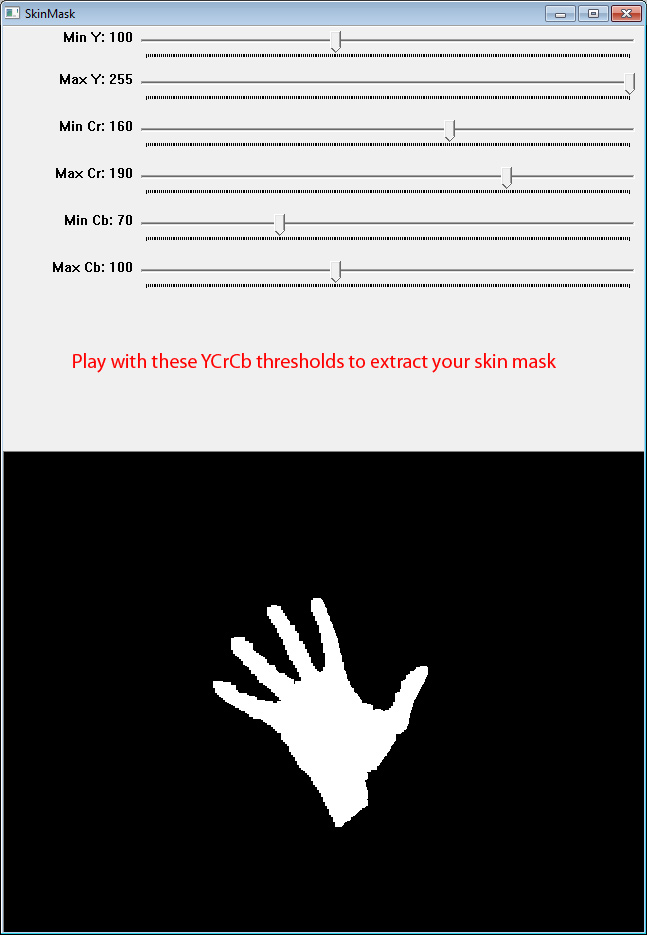
I experimented both manually (by setting up trackbars and manually setting values to optimal range) and by using the elliptical boundary model for skin color detection. While manual settings offer a better and finer control, it's a pain to adjust the values.

So, by now you probably have effectively separated the hand component from the rest of the image. Your resulting image may look something like this:

http://federico-mammano.github.io/Looking-Through-Oculus-Rift/images/SkinMask.jpg


A little rough around the edges eh? To soften the rough edges, we can use this simple morphology snippet:

## Used for erosion and dilation
kernel = np.ones((size1, size2), np.uint8)

## Erode then dilate to smoothen out the edges. Check their documentation for more details
frame2 = cv2.erode(frame, kernel, iterations = 1)
frame2 = cv2.dilate(frame, kernel, iterations = 1)

## Use opening and closing morphological transformations to remove those annoying little dots
frame2 = cv2.morphologyEx(frame, cv2.MORPH_OPEN, kernel)
frame2 = cv2.morphologyEx(frame, cv2.MORPH_CLOSE, kernel)

To smoothen it out more, we use Gaussian Blur and then threshold using the Otsu algorithm as shown:

## Here, (x, y) is a tuple denoting the Gaussian kernel size, with Gaussian kernel standard deviation ## in X direction being 0, (for Y direction, it is 0 by default)
imgYCC = cv2.GaussianBlur(imgYCC, (x, y), 0)

## Set 0 and 255 to the desired minimum and maximum thresholds. (Psst.. experiment time)
ret, imgYCC = cv2.threshold(imgYCC, 0, 255, cv2.THRESH_OTSU)

yawnnn... OK, so now we have a nice and smooth image to work on. Looking back at it all, it doesn't look like we have a long way, but believe me, getting here the way we did is big task. Extracting the hand out of an RGB (or BGR, as it used in OpenCV) image is half the job (well, a little less than half, but you get the point). In the next post, we'll discuss a little more about hand exatraction, specifically blob analysis. Then we'll continue on to detecting the hand, and experiment with algorithms to accurately detect parts of the hand.

And this is the point where I am looking at you, no expression, a blank poker face, hoping you'll get the signal, say thanks and bid farewell.. No, I don't mean you to go, it's just.. I'm tired and there's a lot more I'd like to talk about in more detail, but some other time. (Very soon, I promise). So, there you go. Go on and experiment, research, play/mess with the code we wrote today. And if you like, you can even check out our project Dex, as we call it. Help will be much appreciated ;)

As a great wizard once said,

Fly, you fools!

Happy coding :)


1 The first Minor project idea was that of an automated bot that would crack Google's new NoCaptcha reCaptcha system by imitating organic mouse movements and selecting the correct images for the given keyword. Sadly, it was dropped because of time constraints.
Read More

Inspiration from a simple yet beautiful Chrome extension took me on an adventure with Firefox add-ons. As want turns into need, this is what happens when developers _need_ something.

Hey, do you use Google Chrome most of the time? All the time? Good for you. 'Cause I don't. I like Firefox better. I have my own reasons (not getting into that here). But you know what, I'm jealous of you. No seriously, I am jealous of Chrome users. I mean, you have an extension for everything. Literally. Need something to dim the webpages at night? Bang! There's an extension. Need a prettier new tab page? Boom! There you have it. And why do they have to be pretty? Why does every extension in Google Chrome have to be pretty and smooth and bursting with colors? What is it, Disneyland? If you've read my last blog post, you'd probably know what this is one is about. This post is about... (drum rolls) ... another Firefox add-on. This time, it's about Blink. A Firefox add-on I made to make the new tab page more interesting. Here's how it started:

Fading out, Ripple effect, Entering black and white flashback

It was a bright sunny day in the city of Delhi. I was in college hanging out with my buddies, happy and oblivious to what was going to happen next. One of them was doing something on his laptop. And there, I saw a glimpse of something so intriguing and enticing, that could not help but ask what that beautiful webpage was called. Turns out, it wasn't a web page. It was his new tab page. Yes, New Tab page. The most ignored browser tab i the history of computer. My friend told me it was a Chrome extension called Tabbie. A lovely piece of software craftsmanship and curios innovation. I wanted it. I needed it. I had to have it. Just like a 6 year old needs that Superman action figure.

Ripple effect.. Fade back in.. Back to the future present

But alas, no one cares to make pretty extensions for Firefox. 'No problem, I'll make one' said a voice inside my head. And there it started.
There were already some New Tab replacement add-ons for Firefox, but nothing like what I wanted. Oh, did I forget to tell what Tabbie (and now Blink) do? Silly me. Well, you know how there's a tonne of websites and webpages you follow to keep you updated with stuff you like? You might enjoy some beautiful art and animations from Dribbble, or some tech news from TechCrunch or the likes. That's exactly what they do. These extensions bring the latest news from around the world right to your New Tab page. Why new tab page? Because that is the one page you open the most, and yet never pay attention to. It's the perfect spot to put some nice content and grab your attention. So there I was, spending most of my spare time in searching and experimenting things for Blink. There were a few key checkpoints I am particularly fond of. Here they are:

<geek>

  1. Clearing the URL bar when opening a custom New Tab page. One thing we don't want is to see an ugly url in the URL bar of the New Tab page. It should be empty, without fail. To do that in Firefox, we can use gInitialPages list of the browser. Adding a URL to this list makes Firefox show it as a blank url. So, adding our custom New Page's url to this list should serve our purpose well. Here's a code snippet that shows how to do this,
  2. const clearTabUrl = function() {
        let windows = windowMediator.getEnumerator(null);
        while (windows.hasMoreElements()) {
            let window = windows.getNext();
            if(window.gInitialPages.indexOf(newTabURL) == -1)
                window.gInitialPages.push(newTabURL);
        }
    }
    That does the trick. You see that I saved the current New Tab url for later use. That's because currently the user cannot manually change the newtab.url property (unless they edit it from about:config page). So, it is very important to remove your url from this list when your add-on is uninstalled/disabled in order to restore previous settings. For that, we can simply set an unload listener for the add-on and remove the url from it. Something like
    const clearSettings = function() {
        services.set("browser.newtab.url", oldNewTab);
        let windows = windowMediator.getEnumerator(null);
        while (windows.hasMoreElements()) {
            let window = windows.getNext();
            if(window.gInitialPages.indexOf(newTabURL) > -1)
                window.gInitialPages.splice(window.gInitialPages.indexOf(newTabURL), 1); 
        }
    }
    Ok, hate to admit, but I'm not a genius. I didn't figure this out by myself. The credit goes to this post on Michael Kaply's blog. Check it out for more on overriding the new tab page.
  3. Another thing I'm particularly excited about is that Blink allows the users to configure their feeds. That is, you can add new content to your feed simply by adding the link to its RSS feed. (Yeah, Blink works on RSS). Making that part of Blink was a brainer. Not because it's tough, but because it's not so intuitive. I'll give you a hint on how I managed it: simple-storage module and message-passing. Got it? No? Chill, the code for it is here. See the two pagemods and a couple of scripts that run when certain pages are loaded? That's it. Those scripts are doing a classic Firefox add-on style message passing dance. That's new feeds can be added and unwanted be removed, by just passing around the list of desired feeds.
  4. Parsing the feed.
    I know covering this would basically cover the whole add-on code, but sorry, can't help it. This is the part I learned partly from here and partly by experimenting with Google Feed API and the DOM API. For a quick run-through, check this code out:
function addContent(url) {
  console.log("Parsing feed from: " + url);
  var container = document.getElementById('cards-container');
  $.ajax({
    url:'https://ajax.googleapis.com/ajax/services/feed/load?v=1.0&num=10&callback=?&q=' + 
        encodeURIComponent(url),
    dataType: 'json',
    success: function(data) {
      $.each(data.responseData.feed.entries, function(key, value) {
        var title = value.title;
        var imageSource = getImageSource(value.content);
        var contentSnippet = value.contentSnippet;
        var link = value.link;
        // create card
        if(title.length > 0 && link.length > 0) {
          var cardsource = newHope(title, imageSource, contentSnippet, link);
          var card = document.createElement('div');
          card.setAttribute("class", "col s12 m4");
          card.appendChild(cardsource);
          container.appendChild(card);
        }
      });
    },
    error: function(jqXHR, textStatus, errorThrown) {
      console.log("jqXHR: " + JSON.stringify(jqXHR) + 
                    "\nstatus: " + textStatus + "\nerror: " + errorThrown);
    }
  });
}
The method calls for getting card and image facilitate creating the material cards in which the news items are shown. It uses the Materialize CSS framework. You can check the full code out here.

</geek>

So, that was that. Blink is available here for your evaluation. It's ready for use by people, even though just v0.2.1 (It's stable, don't worry). Want a sneek-peak right away? here:


There are a couple more features I want to add to Blink. And honestly, I too feel a complete UI overhaul is required. But because of the imminent change in the Firefox SDK as declared by Firefox here, some API features will be removed. (The one that concerns Blink, and even Owl for that matter, is the Chrome authority). So, I'll pause the development of Blink till I know better. Feel free to check out the Blink's source on Github, it's under MIT License, so go crazy!

See you soon.
Stay Hungry, stay foolish :)
Read More
Being a software developer usually means long hours of working on computer, staring at the screen as if the meaning of life was hidden somewhere in those lines.

Being a software developer usually means long hours of working on computer, staring at the screen as if the meaning of life was hidden somewhere in those lines of code. But developer or not, looking at bright screens for longer durations is very straining to the eyes for everyone. So I prefer setting my IDE's theme to Darkula, or a similar dark theme, to save my eyes from being scorched. And have to admit, it's very cozy. The nice and dark background with dim-florescent text soothes the eye like the cool brook water to the lonely traveler.
All looks fine so far, but then suddenly, there is this function I need to use, but I can't remember it's correct usage. Or a weird error I haven't seen before, and I can't figure it out. And the only way out? Google. This is where the problem arises. The Internet has somehow developed a fondness towards bright white/ off-white backgrounds. Every typical website has a pale white background and text in black, links in blue. Regular Internet standards, can't complain. But for someone who is just switching from a dark IDE screen to the browser, this transition can torch the eyes. (You're more likely to understand this if you too like dark themes for your IDEs, or work a lot with Photoshop or Illustrator.)
And then one day, I decided I've had enough. I _needed_ something to turn those glaring websites dark. Thus began a quest for browser extensions. I use Firefox as my default browser, AMO my only hope. Surprisingly enough, I couldn't find an add-on that would do what I needed done. There were some that made an overlay on the webpage and displayed only the main content, doing away with distracting images and links. But nah, this ain't what I want.
So I figured, "Hey, if there isn't a good add-on out there to do this, why not make one for myself". And in this moment, the idea of Owl was born. I began with Mozilla's blog post "How to develop a Firefox extension" and realized that this mini-project needs JavaScript. And I don't know JS. Yet.
First things first, I took a Udacity course on JavaScript Basics (nice course, easy peasy). Now that I had a basic idea of js, it was time to code.
I guess I'll take a slight detour from the story and get you familiar with the Firefox add-on development process. First, you need to get the SDK. Installation is simple, and the documentation fantastic. Just follow the link above and you'd be ready for dev even before you know it. (Psst.. One more thing, by default, the cfx tool is installed with the SDK. It's cool 'n all, but it's been recently deprecated. So, might wanna take a look at jpm. You can skip if you're not in the mood, doesn't matter so much right now.)
Installed and ready? Great. Let's get our hand dirty with some code. To create a new add-on skeleton (booooo....skeleton...boooo.. jk), pull up terminal and do


$ mkdir hellworld-addon

$ cd helloworld-addon

$ cfx init            # Assuming you have activated it. If not, go the SDK 
                      # directory and do '$ bin\activate'

For jpm, just replace cfx init by this

$ jpm init                    # jpm doesn't need to be initialized.
 
Tada, a new add-on has been created. But it doesn't do much yet.
Anyways, back to the story. I too followed these steps and created skeleton for Owl add-on. Now comes the tricky part. Code.
I need a piece of code that would change the background of the whole webpage to some dark color I want, and change the text and link colors accordingly. For this, I came with my first amateur solution. We know that HTML webpages contain div-elements. Sometimes, lots of them. What if we iterate through all the div-elements of the webpage, and set a dark background for each of them. The code looked something like this:
  

var divs = document.getElementsByTagName("div");

for(var i = 0; i < divs.length; i++){

   divs[i].style.backgroundColor = 'black';

}
 
To compile and run an add-on, we simple execute

$ cfx run

or for jpm,

$ jpm run

The results were, well, bad. It worked well on Google homepage. But that was about it. Everywhere else, one or the other element was left out. This wasn't working. At all.
So, back to the thinking chair. While surfing through the Add-on SDK documentation, I discovered that it was also possible to add CSS dynamically to webpages. So I dug a little deeper and figured out a way to add a seemingly-alright CSS to the webpages when they load. This time, the results were better. But still, no. Something wasn't working. (Actually, a lot it wasn't). Sometimes there'd be no change at all, sometimes the whole webpage would turn black. So Plan B failed too.
Nevertheless, the need to protect my (rather our) eyes from the glaring white webpages was strong enough to keep me looking. A week later, I stumbled upon this. Doesn't look like much, but it is actually a way to attach style sheets to a webpages without disturbing other content. So, there I was trying to make this work. Thanks a good example I found online (sorry, lost the link), I wrote (copied) a CSS style sheet that could modify the webpage's theme to what I want. (The final CSS I decided on was this). Compile and run. Fingers crossed.
Great Scott! It works! Though a couple of glitches, (some icons/images disappeared) but it was waaay better that any of the previous attempts. "That's it!", I said to myself. Now, all I need is an icon for this extension, and it's ready to be published. Quick google search of 'owl cartoon' gave a cute looking owl with big-bright eyes. I knew this is the one. Got the image, quickly edited with GIMP, made grayscale versions and done! There we have it.
To publish an extension, we are needed to bundle it up in .xpi file. Again, terminal to the rescue:

$ cfx xpi

or for jpm,

$ jpm xpi


And there we have the xpi. Now, simply drag and drop this xpi into firefox and it'll install automatically. There you go, a ready-to-use homebrew add-on.
Having made the add-on, I decided to publish it online, to the AMO. You know, maybe there are other people who need this? So I went ahead and published it here.
Not even a week passed since I put it up online, I get this email from I Free Software (a nice tech blog) that they have reviewed my add-on and they really liked it :). Check out this cool badge they sent me.

I love Free Software 5-Star badge


Is this amazing or what! Shout out to I Free Software for their awesome review.
Signing off,
Enjoy!

PS: The source code of the add-on is available on Github under MIT License. Feel free to play with it :)
Read More